5.1.3 DATA REPRESENTATION
Data representations are graphics that display and summarize data and help us to understand the data’s meaning.
Data can be represented using various methods, including:
(a) Pictographs
(b) Pie Charts
(c) Line graphs
(d) Bar graphs
PICTOGRAPHS
A pictograph is a representation of data using images or symbols.
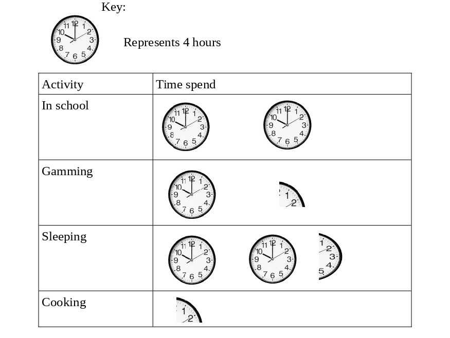
Example 5.2
The data below shows how Peter uses his day.
| Activity | Amount of time |
|---|---|
| In school | 8 hours |
| Gamming | 5 hours |
| Sleeping | 10 hours |
| Cooking | 1 hours |
Draw a pictograph to represent the data.
PIE CHARTS
A pie chart is a type of graph that represents the data in the circular graph. The circle is divided into sectors whose side depends on the size of data being represented.
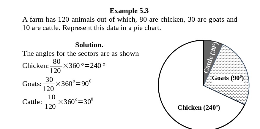
Example 5.4
The figure below shows a pie chart showing the number of cars by manufacturer in a car yard. Determine the number of cars for each manufacturer if the yard has 24 cars.

BAR GRAPHS
A Bar Graph is a graphical display of data using bars of different heights. The bars are uniformly spaced.
Example 5.5
A survey was conducted on 100 students to determine what they wanted for lunch. The following data was obtained.
| Rice | Chapati | Githeri | Ugali | Yams |
|---|---|---|---|---|
| 25 | 30 | 10 | 20 | 15 |

LINE GRAPHS
Line Graph is a graph that shows information connected in some way (usually as it changes over time).
Example 5.6
| Time | 8.00 am | 9.00am | 10.00am | 11.00am | 12.00noon |
|---|---|---|---|---|---|
| Temperature (°C) | 23 | 24 | 26 | 25 | 23 |
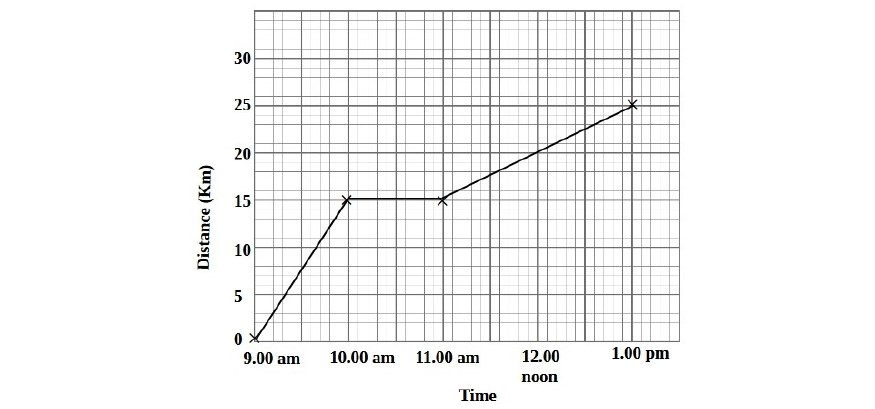
TRAVEL GRAPHS
In this section, we will deal with graphs which show the distance covered against time taken.
Example 5.7
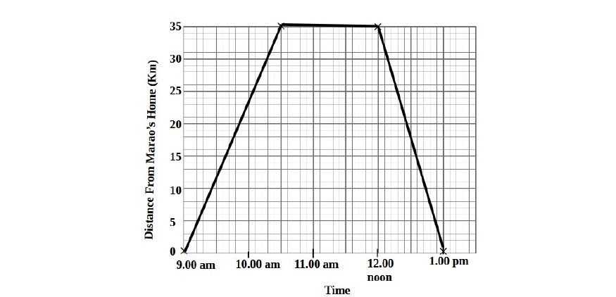
Example 5.8
Exercise 5.2
1.
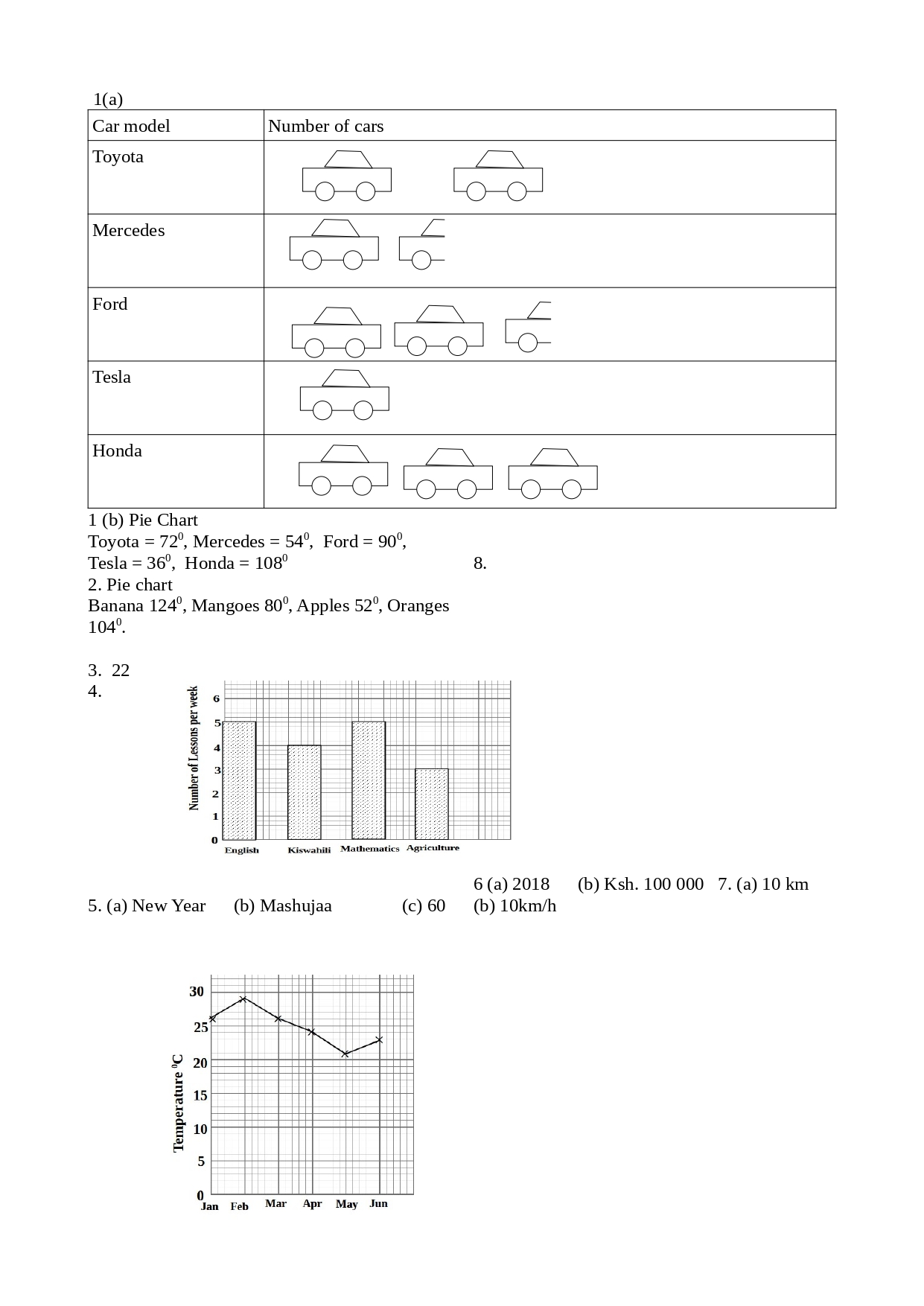
The number of cars in a car yard classified according to manufacturers were:
| Toyota | Mercedes | Ford | Tesla | Honda |
|---|---|---|---|---|
| 20 | 15 | 25 | 10 | 30 |
(a) Using the symbol to represent 10 cars, draw a pictogram of the data.
(b) Draw a pie chart for the data.
2.
A sample of 180 students were asked to state their favorite fruit.
| Banana | Mangoes | Apples | Oranges |
|---|---|---|---|
| 62 | 40 | 26 | 52 |
Draw a pie chart to represent the data.
3.
After taking stock of the brands of soft drinks in his shop, Mutuku drew a pie chart shown below.

Determine the number of bottles of Cocacola if bottles of Fanta were 18.
4.
The number of lessons per week of various subjects are as shown.
| English | Kiswahili | Mathematics | Agriculture |
|---|---|---|---|
| 5 | 4 | 5 | 3 |
Draw a bar graph to represent the data.
5.
Study the bar graph below and answer the questions.
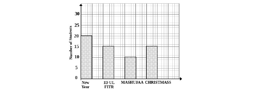
(a) Which festival is most liked by the students?
(b) Which festival is least liked by the students?
(c) How many students were involved in the survey?
6.
The average temperature per month for the first six months of 2022 in degree Celsius are shown in the table below.
| January | February | March | April | May | June |
|---|---|---|---|---|---|
| 26 | 29 | 26 | 24 | 21 | 23 |
Draw a line graph to represent the data.
7.
The line graph below shows the amount of profits made by Smart Press printers.

(a) Which year was the highest profit posted?
(b) How much profit was posted in the year 2017?
8.
Jane rides from Town A to Town B. The diagram below shows a distance–time graph for the journey.

(a) How far is Jane from A at 8.00?
(b) Calculate Jane’s speed in the first two hours of the journey.
Answers